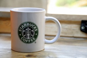
Starbucks has decided to modify aspects of its visual identity (name / logo) and in-store brand experience. The name Starbuck’s Coffee has been dropped, the current logo of a siren (errr, that’s just a mermaid to you and me) has been updated and the famous Starbucks mugs are to be replaced by bone China. Starbucks made these changes because it wants to expand its brand’s presence in groceries (where it already sells tea and ice creams), respond to increasingly sophisticated coffee consumers and stiff high street competition.
Wavelength’s view? This branding heavy weight has taken three steps one once. Removing the name, the word coffee and the updating the logo. Bad move. If the brand wants to spread its wings beyond coffee removing the word “coffee” makes sense. Not many people say “lets go for a Starbuck’s coffee now”. The word coffee is redundant. It’s also strategically restrictive. But why remove the name Starbucks? The equity surrounding this name is considerable ($3,339m according to Interbrand’s 2010 survey). Talk about shooting yourself in the foot.
With the text gone it puts an emphasis on the logo. This begs the question “what does the Starbucks logo mean?” Strong logos are metaphors for meaning. They convey a concept, promise or values that ‘work’ for the brand. Citi Bank’s umbrella indicating protection is an example. Now the text has gone the logo will have to work harder to convey the brand concept. We wonder if it works at all.
Starbucks should have phased out the word ‘coffee’, established the Starbuck’s brand name in new markets with its current visual identity (which it could have updated at a later date). One step at a time. It is debatable if the name Starbucks should ever be phased out given its equity. It if is phased out this still leaves the problem of a logo which appears to have little meaning. The mermaid conveys concepts of the sea and myths. Is this what Starbuck’s is about?
On the upside Starbuck’s clearly understands the role of other tangible cues as a part of delivering its brand experience. This is why it’s phasing out the mugs. Yes, they may remove themselves from that homely feel so cleverly created by the sofas, papers and scrumptious cakes. If they want to go slightly up market other changes will happen in their outlets. Modifications to art, menu, music may all be examples of how the brand experience is taken up market.
Final comment. The re-appointed Starbuck’s CEO, Howard Shultz says this is a “meaningful update”. I just wonder if it’s an exercise in explicit management control.
Lets watch this space and hope Starbuck’s isn’t another Gap waiting to happen. It may mean the Starbucks mugs can still be found elsewhere.
Please note this blog was updated at 0054 gmt (9th Jan 0011) after a typographical error was identitifed. All other content remains unchanged.
I’m afraid the only question this article poses is whether it has been properly researched.
Starbucks in the UK do not sell ice-cream, that is only in US stores.
The alterations to the brand were made after trial stores and concept stores were created and feedback subsequently integrated into the marketing changes.
The ‘mermaid’ you refer to has a very specific place in the Starbucks brand, and from the numerous coffee chains internationally that have adopted similar logos it is clearly evident that the siren is synonymous with Starbucks Coffee.
The logo also has a meaning which it would not have taken more than 5 minutes to find out about. I appreciate the meaning may be a little detached from the modern day coffee company but denying it has a related meaning and little brand presence seems very ignorant.
Lastly, the CEO of Starbucks is Howard Shultz, not Donald Shultz.
In future it might be better to do some research before assessing anything, especially if you intend to paint such a negative picture.
Thank you for your sterling response and highlighting the typographical error. That has now been changed. Much appreciated.
To address your points……
I’m not sure if we mentioned location i.e. the UK in our post? Took a broader perspective.
There’s a fundamental problem with trials. People often tell you what you want to hear. I’ve seen it on numerous occasions in the mobile space where customers have said they want services but alas they didn’t take off. Certain questions can give certain answers. We also do wonder if your findings were influenced by the setting…..
In terms of the Siren, it may have a specific place in the Starbucks brand and yes, imitation is the best form of flattery. Our point concerned the metaphorical meaning of the Siren i.e. what brand-related associations does it connote? Any detail / clarification on the Siren’s meaning would be appreciated.
It is questionable if customers would spend five minutes trying to grasp the meaning of the logo……surely this is who you want the meaning to connect / resonate with? That was our point. Further, if the meaning is detached from a modern day coffee company, how was it ever attached to a coffee company at the start? You raise some really interesting points here about brand and semiotics.
Negative picture….we’d like to think balanced given our views on the brand experience moves that appear to be afoot.
I think we’ve addressed you points. Can you now reveal your identity……?
At the risk of puncturing a great philosophical debate, it may perhaps be that the old logo made it perfectly possible, with diligent use of the right colour of green magic marker, to adapt Starbucks’ collateral materials to read “F**k off”
Indeed, a number of activists (allegedly acting in the interests of supporting smaller companies survive against corporate behemoths) around the world have been doing this and delighting in publishing photos online. At one stage last year (or perhaps the year before) they had even hijacked a starbucks.co.uk website to show off their handiwork.
If people were doing that to my logo, I’d change it, too.
Hi Ray, thanks for your response. I’ve never thought of it like that before…..interesting take on factors that inform brand strategy!